Facebook cover photos are a perfect example of how social media marketing is different than just regular social media usage. A great personal cover photo can be anything that compliments your Facebook profile, but business cover photos need to do much more.
A Facebook business Page cover photo should feature strong branding and accurately represent your business. It also must be high-quality and perfectly optimized for display; this means knowing the perfect Facebook cover photo size.
This post is going to take a look at the perfect Facebook cover photo size and best cover photo practices to help your images represent your business exactly how you want.
Facebook Cover Photo Dimensions
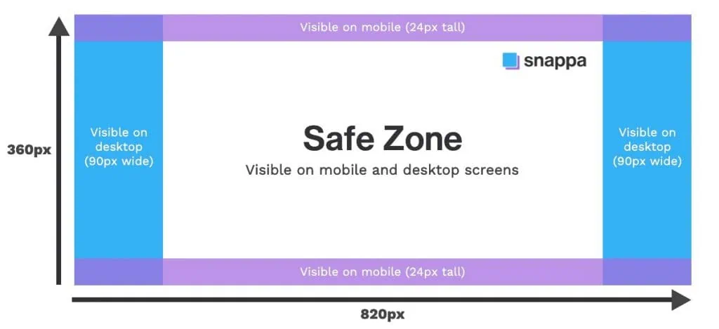
According to Facebook, cover photos load fastest as a JPG file that’s 851 pixels wide by 315 pixels tall and less than 100 kilobytes. This is a great starting point, but of course it’s never quite that simple. It’s tricky because Facebook cover photos display differently on desktop and mobile devices. The left portion of your cover photo will also be partially covered by your profile picture.
Your cover photo will display at 820 pixels wide by 312 pixels tall on computers and 640 pixels wide by 360 pixels tall on smartphones. Therefore, we recommend using the dimensions 820px by 360px for Facebook cover photos, and to keep all text and graphics in the middle safe zone as per the specifications below:
Cover Photos on Desktop vs. Mobile
When designing your Facebook cover photo, you need to be careful because the cover image is displayed differently on desktop and mobile devices. Although, designing with safe zones in mind will ensure that your Facebook cover photo displays properly on all devices.
On a desktop computer or laptop, Facebook displays more of your cover photo’s width while slightly cropping the top and bottom. Fortunately, Facebook doesn’t stretch or distort an image to fit a certain dimension; it crops it automatically instead.
The desktop view will show most of your Facebook cover photo design, with the profile picture slightly covering the bottom left side.

On a mobile device, your Facebook cover photo will crop out the sides, while showing more of the cover photo’s height. The profile picture also covers a larger portion of the cover photo on the left side.
If you want to optimize your Facebook Page for mobile viewing, it’s recommended to use a background pattern or high-quality background image as your Facebook cover photo. A great example from Shopify’s Facebook Page is shown below:

With all that being said, we recommend using the Facebook cover photo size of 820 pixels by 360 pixels and designing within the safe zones. This will ensure that none of the critical components of your cover photo are getting cut off on desktop or mobile devices.
How to Create a Facebook Cover Photo with Snappa
If you’re ready to create a Facebook cover photo, our powerful and easy-to-use graphics builder has made this process incredibly simple. Here’s a step-by-step video showing you how to create a Facebook cover photo with the right size using Snappa.
Here are some screenshots to help walk you through the whole process. You can choose the Facebook cover photo pre-set for an automatic perfect cover photo size.

Once you’ve selected this option, you can choose from one of our pre-made Facebook Cover templates (which are fully customizable) or create a cover photo from scratch.

Even if you use a template, you can upload your own image or choose from our library of images. Add text, graphics, shapes, and effects to any part of the image. All of these add-ons can be dragged and dropped easily; you can define the opacity of each, and choose what layer you want them to show up in.

You’ll notice that we also include an overlay showing the mobile and desktop only zones of your Facebook cover so you’ll never have to worry about text and graphics getting cut off.
What Should My Facebook Cover Photo Be?
Aside from choosing something that is both high quality and relevant to your business, it can be difficult to know exactly what your cover photo should feature. That depends entirely on you, your business, and what you believe your target audience will be most receptive to.
Some great ideas for use cases of cover photos include:
- Use your cover photo to drive sales or lead generation. I believe very strongly that the “social” should come before “marketing” in social media marketing, but that doesn’t mean that there’s no room to promote your business. A cover photo designed to drive sales or leads, combined with a relevant CTA Page button, can get you more results without a lot of extra work on your part.


- Feature UGC. User generated content is one of the most powerful marketing tools at your disposal; using this authentic type of content in your cover photo can go a long way in building brand loyalty.
- Advertise upcoming events. If you have a free webinar, a conference, or even a social contest that’s coming up soon, don’t be afraid to feature it in your Facebook cover photo. It’s an effective way to let new users know about it right away.

- Demonstrate product features & benefits. Showcasing product features and benefits can help increase sales and set you apart from the competition.
- Show off your store. If you happen to have a storefront or an office space where you’re located, it can make a stunning photo and increase foot traffic.
- Feature team members & employees. Employee generated content (EGC) can be just as valuable as UGC, and featuring real employees in your cover photo can humanize your business and show the real people behind it.
Creative Facebook Cover Photo Ideas
If you’re looking for some cover photo inspiration, look no further than these 6 creative cover photo examples we’ve designed for businesses in various industries.
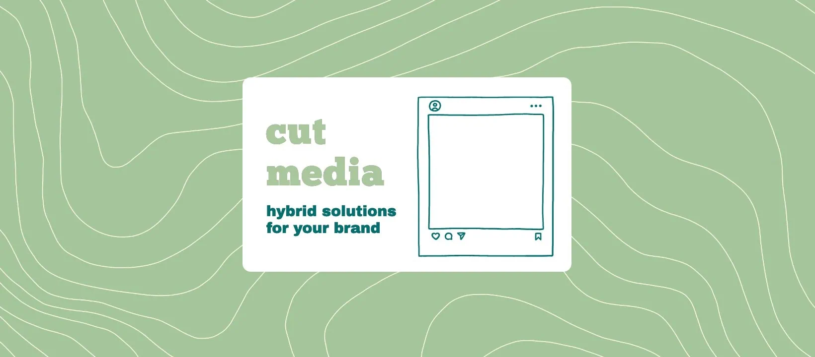
Adding Hand-Drawn Illustrations
Keep your cover photo playful and fun by adding hand-drawn illustrations to your banner. Illustrations are a great way to add personality to your images without taking away from the core message. If you have a cover photo designed and you’re wondering what more you can do – try adding in some illustrations from our library.
Using Shapes & Outlines
Make your Facebook visuals stand out by adding shapes to your designs. There are endless ways that you can incorporate shapes into your Facebook cover image. Try experimenting with different colors and outlines to make your banner pop!

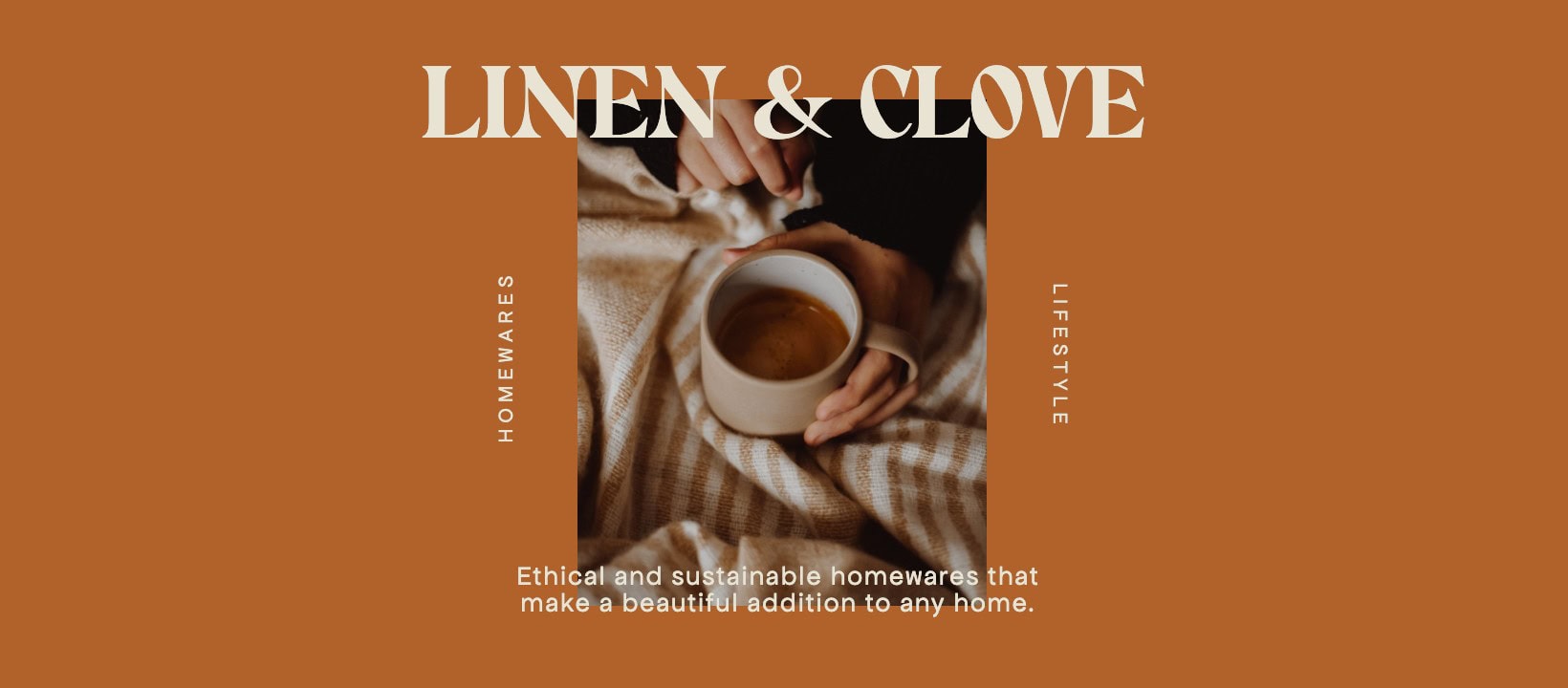
Using Lifestyle Images & Removing Text
Less is more when it comes to designing a strong Facebook banner image. A good way to showcase your business is to incorporate a simple lifestyle photo that is relevant to your brand. Text isn’t needed in your cover photo if it doesn’t add any value – removing it will keep the image minimal.

Adding Contrast to Text & Photos
Having a busy Facebook background image can take away from your banner text. To help your text stand out, add some contrast by darkening the background and bolding your headings. Doing so allows your followers to easily read the text without distraction.

Adding Playful Icons
Catch visitor attention by using relevant icons in your Facebook cover photo. You can add icons around your text, or if you prefer a minimal approach, you can solely use icons in your design. A useful tip is to make sure that your background color compliments your icon colors.

Following a Color Palette
Create an aesthetic Facebook cover photo by following a cohesive color palette. Use our color palette inspiration guide as a way to find a color combo that suits your branding. Being consistent and sticking with a few colors will significantly improve your design and help your banner image look professional.

Facebook Cover Photo Mistakes to Avoid
While you can choose any number of images for your Page’s cover photo, there are a few practices you should stay away from. Certain mistakes will detract from your Page, and may even detract from how new users perceive your business.
Some big Facebook cover photo mistakes businesses should avoid include:
- Using the same cover photo. Facebook header images differ in sizing across Facebook events and Facebook groups. Use the proper dimensions to optimize your pages.
- Having too much text. Some text is great, especially if it’s being used for branding. Some photos, though, only have text overlay against a solid backdrop. This is typically not a good move, even if you’re focusing on an insanely motivational quote; instead, your cover photo should actually be an image that’s able to speak (mostly) for itself.
- Too much clutter. We’ve all seen pictures on social media that have so much going on that looking at them too long might give us a headache. There’s lots of colors and focal points and things to look at. While this might sound appealing at first (it will definitely draw the eye, at least), it’s just difficult to focus on and can appear sloppy.
- Not taking the current Page format into consideration. Facebook changes its formatting fairly often; every time they do, check your cover photo on desktop and mobile devices to make sure nothing is getting cut off.
- Choosing something generic. You want your cover photo to jump out at viewers; that’s partially what it’s there for. Choosing a generic image that could be about your business somehow won’t have the impact that you’re looking for.
- Not including branding. When possible, adding subtle branding touches like your logo can make a big difference with brand recognition.
Where to Find Great Cover Photos
Some amazing cover photos will just be made from graphics, like Buffer’s and Drip’s. Others will utilize actual photographs. Whichever you choose, there are plenty of resources you can pull images from if you don’t have a high-quality image that you’ve taken yourself.
These include:
- Free stock photo sites like StockSnap, Pexels and Unsplash, which offer free stock photos available for commercial use.
- User generated content, which is free and often available in abundance. Some UGC is extremely high quality, and many users would be honored if you used it as part of your cover photo.
Final Thoughts
The perfect Facebook cover photo size goes a long way in helping you make a great first impression with new users. Your image will look good when displayed on both mobile and desktop devices, without bizarre cropping or the image showing up off-center. Combining the perfect cover photo size with Facebook cover photo best practices can help you build the social presence and reputation that you want to create for your business.
