
Video is the hottest thing on social media right now. Businesses and organizations of all shapes and sizes are relying on video to better connect with their target audience, delivering their messages in new, user-friendly mediums that are engaging and dynamic.
There is, however, a lot that goes into video creation– more so than just uploading images or conventional text posts. Video takes longer to create, and you have to consider factors like the best length, formatting, and much more. It’s no surprise that sometimes small-but-crucial details get overlooked.
One of these details is social video thumbnail images.
Many social media platforms that have native video allow you to set an image that will be displayed before the video starts, including both YouTube and Facebook, and every business, brand, or marketer should be taking advantage of this.
If you aren’t sure where to start (or if you’re looking for some new tricks!), keep reading; we’re going to take a look at 7 easy design tips for social video thumbnails that will increase your clicks.
Why You Need Strong Thumbnail Images
Social video thumbnail images are the very first thing that potential viewers will see when they come across your content when they’re browsing. Even with auto-play videos on platforms like Facebook and Instagram, this is still important, because that thumbnail can do a lot to grab users’ attention.

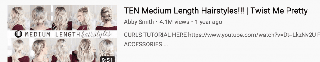
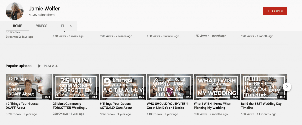
For YouTube, a great thumbnail image is practically mandatory; a weak video thumbnail will cause people to scroll right past your content and click on something from a competitor instead.
If you want clicks and views, strong thumbnails are the way to go. They need to be visually interesting and offer enough context for the video to show users that it’s worth watching. Choosing a strong subject will be great, therefore, but having a few simple design tips in your pocket can go a long way, too.
Let’s take a look at 7 design tips that will help your social media video thumbnails stand out in the right way, generating interest and clicks alike.
1. Add Text Overlay Using Contrasting Backgrounds To Make It Readable
It’s common to see video thumbnails that have text overlay placed over a still image, explaining what the video is all about. Sometimes, though, you’ll see videos that have text that’s hard to read. It could be that the entire phrase is hard to make out, or only some of it, depending on what it’s placed over in the background.
Using borders with colors that contrast from the text will make it instantly more readable. You can also section off part of the video with a solid block of a shape that contrasts with the text and add it there.
Which stands out more, for example, in the two images below?


With Snappa, you can do both in just a few clicks. If you want to add more depth to your text with a contrasting color, you can add a text shadow in the color of your choice. See these two examples:


This can help it stand out more, particularly if you’re having trouble getting it to show up given the background. You can also quickly drag and drop shapes like squares or ovals to place text on. Many of our templates have the latter factored into the design, making this easy work for you.
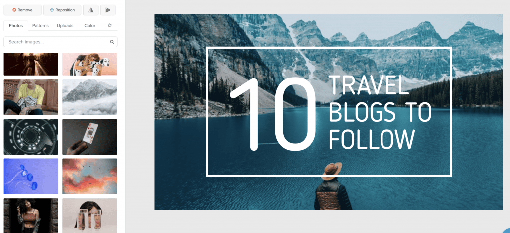
2. Use a Still Shot As The Key Image
A lot of content creators will try to pause the video they’re creating a thumbnail for and grab a still from there. Sometimes this works, particularly if you want to go for a big action shot, but the majority of the time it doesn’t. Live motion just doesn’t always capture well as a still image; it can be blurred, or look just a little bit too awkward.
Your best bet, therefore, is often to use an actual still image that was taken as a photograph as the background image for your video thumbnail image.
Try to make it a habit of grabbing a still photograph while shooting the video, or even posing for part of the video recording, which can be edited out later and used as the still. Grab a picture of the finished meal if you’re creating a cooking video, for example.
If this isn’t possible, remember that you can always use Snappa’s enormous library of free-for-commercial-use stock photos. Find a relevant one and drop it in.
3. Get the Thumbnail Sizing Right
Have you ever seen video thumbnails that look like they were stretched to fit the right dimensions? Most of us probably have, even if we didn’t consciously notice, seeing images that look maybe just a little off.
Starting with a thumbnail that’s the right size is going to be key.
We go into detail for each platform in their own posts. Here are the size requirements you need to know:
Keep in mind that if you aren’t sure where to start, we’ve got pre-loaded templates ready to go that match some of the size requirements, saving you a ton of time in the process.
4. Keep It Clutter-Free
Simple, clean designs are best. Choose still images that don’t feel too overwhelming by keeping the visual clutter to a minimum.
Something like this, for example:

Is much more appealing as a thumbnail than this:

Think bare minimum here. Add just enough that it’s interesting, but not so much that it feels chaotic to look at. You want the viewer’s eye to focus in immediately on the subject of the image so they can get information about the value of the video. If they can’t do that, they won’t stop to check it out.
5. Use Easy-to-Read Block Font
When choosing a font for the text that’s going to be on the video thumbnail, it’s crucial to consider readability. Keep in mind that users are seeing the thumbnail on tiny mobile screens, so choose a block text that’s clear and easy-to-read.
Skip the flowery and edgy text. No cursive; it may as well be webdings on small screens unless the text is absolutely enormous.
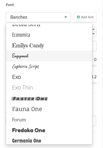
There are plenty of great choices that still allow for a more branded look while being easy to read, but some good ones that are safe in almost every circumstance on Snappa include:
- Sanchez
- Antic
- Roboto Thin
- Sniglet
- Cardo
- Source Sans Pro
- Vollkorn
- Aleo
- Exo
6. Consider Opting for Branded Thumbnails
Having a “branded look” is something that we discuss a lot here on Snappa. Having a distinct, recognizable format for your video thumbnails can help build brand awareness and recognition and drive clicks, while giving a uniform and intentional appearance to your channel as a whole.
Branded thumbnails doesn’t mean that every single one needs to be identical to the one that came before it (though some use the exact same template every time). You can also use the same text and color schemes, or the same general designs or layout while still changing things up. Consider adding your logo and sticking to something visually distinct in order to take advantage of these benefits.
7. Include Simple Graphics & Shapes to Draw the Eye In
If you talk to a graphic designer, one thing that you’ll often hear them mention is tricks that can be used to pull the user’s gaze right to where you want it. Site designers use these same strategies to bring a viewer’s focal point straight to that high-value product or the CTA button they desperately want you to click.
You can use graphics and shapes to help with this, bringing the user’s attention right where you want it, whether it’s on the thumbnail itself or it’s to your thumbnail in a busy feed.
Here are a few tricks that you can use:
-Placing an outline of a shape around a core part of the video, framing it and focusing the eye there. This can (and typically should be) thin, and in a contrasting color.

-Using a simple arrow in a bright color to point to the specific thing you want users to see.

-Include contrasting colors at different parts of the screen, like the red heart from the logo and the text here. This feels cohesive, and brings attention to these two key parts of the image.

Conclusion
There are a lot of choices to make when you’re creating video content for social media, and that should include an intentional and careful design of your thumbnails, too. Putting extra effort in here can increase your clicks, which will make it significantly easier to achieve the goals of the video, like brand awareness lift or clicks to the site to hopefully make a purchase.
The extra time can quickly increase the ROI of your video marketing, there, so take these design tips into consideration and test them out on your next video!
Interested in taking your social video thumbnails to the next level? Start your free trial with Snappa here.
What do you think? Which design tips do you already use when creating your video thumbnails, and which are you most excited to try? What’s worked best for you? Share your thoughts and questions in the comments below!
